NFL uniforms matter more than most fans probably realize.
A football uniform isn’t just fabric, color, stripes, and a helmet. It’s identity. It’s violence dressed up for television. It’s the thing fans see in every memory: the touchdown, the interception, the snow game, the missed kick, the playoff collapse, the Super Bowl parade, the player they loved when they were ten years old.
That’s why the worst NFL uniforms feel so offensive. A bad uniform doesn’t just look ugly. It makes a team feel wrong. The colors clash. The numbers look strange. The helmet ruins the whole thing. The pants don’t match. The jersey looks like somebody designed it during a lunch break after staring too long at a corporate mood board.
Some NFL uniforms are bad because they’re boring. Some are bad because they try too hard. Some are bad because they age like gas station sushi. And some are so strange they almost become charming after enough years pass.
That’s the funny thing about ugly uniforms. Fans hate them in the moment, then later start defending them as “so bad they’re good.” Nostalgia has a way of laundering bad taste.
Still, some uniforms deserve their reputation. Here are the worst NFL uniforms of all time and why fans still talk about them.
Why the Worst NFL Uniforms Stand Out
The reason worst NFL uniforms lists are so fun is that football gives bad design nowhere to hide.
The helmet is massive. The shoulders are wide. The pants, socks, gloves, cleats, and numbers all sit inside the same visual package. If one part goes wrong, fans notice. If several parts go wrong, the team looks like it lost a bet.
A good NFL uniform feels immediate. Raiders silver and black. Packers green and gold. Steelers black and gold. 49ers red and gold. Cowboys white and silver. These looks work because they feel like the team before anyone says a word.
A bad uniform creates distance. You look at it and think, “Who approved this?”
That question has followed plenty of NFL teams over the years.
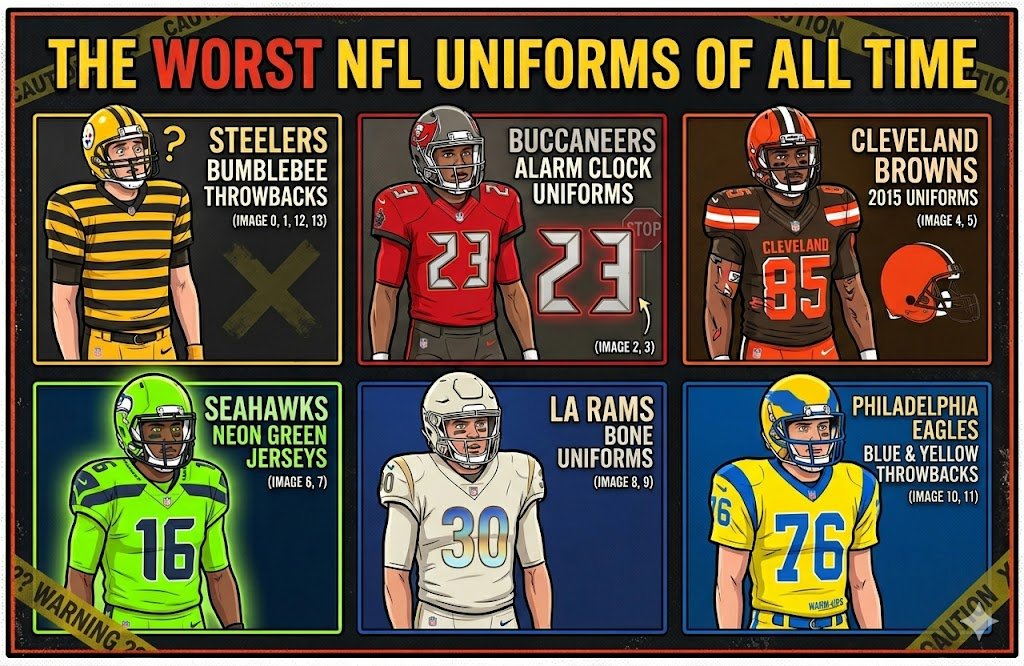
Pittsburgh Steelers Bumblebee Throwbacks
The Steelers’ bumblebee throwbacks might be the most famous ugly uniforms in NFL history.
The jerseys had thick black and gold horizontal stripes, tan pants, blocky number patches, and a look that felt more like old-time prison laundry than professional football. The uniforms were based on an early Steelers look from the 1930s, so they had historical logic. But historical logic doesn’t always mean visual mercy.
On a modern NFL field, the bumblebee uniforms looked absurd.
Players looked wider, stranger, and somehow slower. The stripes swallowed the body. The number boxes looked pasted on. The tan pants made the whole thing feel even older and weirder.
And yet, these uniforms became iconic in their ugliness. That’s why they’re so memorable. A boring bad uniform disappears. The bumblebees stayed in the public imagination because they were impossible to ignore.
They belong near the top of any list of the worst NFL uniforms because they crossed the line from throwback into costume. But at least they had personality. Ugly, yes. Forgettable, never.
Tampa Bay Buccaneers Alarm Clock Uniforms
The Tampa Bay Buccaneers’ 2014 redesign was supposed to look bold and modern.
Instead, fans mostly talked about the numbers.
The Bucs introduced a darker, more aggressive uniform set with oversized helmet logos, sharper color blocking, and strange digital-style numerals that looked like they belonged on an alarm clock or a cheap microwave. That number font became the whole story.
That’s usually a bad sign.
When fans talk more about the font than the football, the design has already failed. The uniforms weren’t completely hopeless in theory. Tampa Bay’s red, pewter, black, and orange can work. The pirate flag logo is strong. The franchise has enough visual personality to support an aggressive look.
But the execution felt busy. Too many panels. Too many tones. Too much shine. And those numbers sat on the jersey like a dare.
The Buccaneers eventually moved away from that look and returned to something closer to their Super Bowl-era uniforms. That was the right call. The alarm-clock uniforms are remembered as some of the worst NFL uniforms because they tried to look futuristic and ended up looking like a failed electronics display.
Jacksonville Jaguars Two-Tone Helmets
The Jaguars’ two-tone helmet era remains one of the strangest visual decisions in modern NFL history.
The helmet faded from black in the front to gold in the back. In theory, maybe that sounded bold. In practice, it looked unfinished, like somebody spray-painted half the helmet and got called away before the job was done.
The rest of the uniform set had problems too, but the helmet dominated everything. A helmet is the face of an NFL team. If it looks wrong, nothing else can save the uniform.
Jacksonville has always had a tricky visual identity. Teal, black, gold, and jaguar imagery can be excellent when handled well. The franchise has had some sharp looks. But the two-tone helmet felt like design experimentation for experimentation’s sake.
It didn’t say fierce.
It said confused.
The Jaguars eventually cleaned up their look, and the two-tone helmet became a warning sign for future redesigns. Bold isn’t always better. Sometimes bold just means everyone notices the mistake faster.
Cleveland Browns 2015 Uniforms
The Browns have one of the simplest identities in football. Orange helmet. Brown, orange, and white. No logo on the helmet. No nonsense. That plainness is the whole point.
Then the 2015 redesign arrived and tried to make the Browns look modern.
That was the problem.
The jerseys featured giant “CLEVELAND” lettering across the chest, contrast stitching, awkward striping, and orange numbers on brown jerseys that could be hard to read. The pants had oversized wordmarks running down the leg. The whole look felt like someone tried to turn the NFL’s most stubbornly traditional team into a college program with too much Nike energy.
The Browns don’t need that.
Cleveland’s football identity works best when it feels blunt and unfussy. The 2015 uniforms tried to add attitude but mostly created clutter. They didn’t make the Browns feel tougher. They made them feel overdesigned.
The team eventually returned to a cleaner, more classic look, which told fans everything they needed to know. Some franchises can modernize dramatically and survive it. The Browns aren’t one of them.
Their strength is simplicity.
The 2015 uniforms forgot that.
Seattle Seahawks Neon Green Jerseys
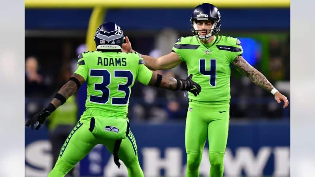
The Seahawks’ neon green jerseys are divisive, which makes them perfect for this list.
Some fans love them because they’re loud, unmistakable, and very Seattle in a modern sports sense. Others think they look like highlighter ink got into the laundry.
The problem with neon is that a little goes a long way. Seattle’s usual navy, gray, and action green works because the bright green acts as an accent. It flashes. It gives uniform energy. But when the whole jersey turns neon, the balance disappears.
Suddenly, the players look less like an NFL team and more like a safety campaign.
That doesn’t mean the look has no value. It’s memorable. It photographs loudly. It fits the Seahawks’ willingness to be different. But as a full uniform, it can be hard on the eyes, especially under prime-time lights.
The neon green look belongs among the worst NFL uniforms for fans who prefer classic football style. But unlike some disasters, it has defenders. That makes it less a total failure and more a visual argument.
Los Angeles Rams Bone Uniforms
The Rams’ “bone” uniforms from their 2020 rebrand became an instant target.
The idea seemed to be a soft off-white road look, something modern and unique. But fans quickly started calling them dirty laundry uniforms. That’s a hard label to escape.
The Rams have one of the best visual foundations in football: royal blue, yellow, and helmet horns. They don’t need muted beige-gray uniforms. They don’t need to look like a minimalist lifestyle brand. They need to look like the Rams.
That’s why the bone uniforms frustrated people. They felt disconnected from the team’s strongest identity. The classic Rams look is bold and clean. The bone look felt washed out. It didn’t have the same energy, and it didn’t give fans the nostalgic punch they wanted when the team returned to Los Angeles.
The Rams won a Super Bowl during this branding era, so the uniform set gained some historical protection. Winning always helps. But the bone look still feels like a classic case of a design team trying to be clever when the obvious answer was better.
Sometimes the best uniform idea is the one fans already love.
Philadelphia Eagles Yellow and Blue Throwbacks
The Eagles’ yellow and blue throwbacks were historically inspired, but that didn’t make them easy to watch.
The bright yellow and powder blue combination came from the franchise’s early history, before the Eagles became associated with green. As a throwback concept, it made sense. As an NFL uniform on a modern field, it looked bizarre.
The colors felt more like a forgotten college team than the Philadelphia Eagles. Fans used to midnight green, kelly green, silver, white, and black had to watch their team run around in colors that felt completely disconnected from the franchise’s emotional identity.
That’s the risk with throwbacks. Accuracy doesn’t always equal appeal.
Some old uniforms come back and look timeless. Others come back and remind everyone why they stayed buried.
The yellow and blue Eagles uniforms weren’t boring, and they weren’t meaningless. They were just ugly in that special throwback way where the history lesson doesn’t make the eye strain worth it.
New York Jets Black Alternates
The Jets have a visual problem: their best looks usually involve green, white, and some version of a classic aircraft-inspired identity.
So when the team leaned into black alternates, the result felt generic.
Black uniforms can work when black is central to the franchise identity. Raiders? Perfect. Steelers? Essential. Saints? Natural. Falcons? Sometimes. But for the Jets, black often feels like an add-on, the kind of alternate color teams use when they want to sell more jerseys but don’t have a better idea.
The Jets’ black uniforms weren’t the ugliest uniforms ever. They were worse in another way: they felt unnecessary.
That matters. A bad uniform can still be interesting if it says something. The Jets’ black alternates mostly said, “We also have a black version.”
For a team with a name that offers so much visual possibility, that’s a missed opportunity. Jets should feel fast, green, sharp, and tied to motion. The black alternates felt like they could’ve belonged to almost anyone.
That’s why they deserve a place in the worst NFL uniforms conversation. Sometimes generic is its own kind of ugly.
Tennessee Titans Modern Uniforms
The Titans’ current uniform era has had plenty of critics.
The team moved from a cleaner navy, white, and powder blue look into a darker, more angular design with sword-inspired shoulder elements and a complicated number style. The concept made sense on paper. Titans. Swords. Strength. Mythology. Fine.
But the final result has never felt as strong as it should.
The Titans have one of the more underrated color palettes in football. Navy, light blue, white, and red can look excellent. The Oilers throwback look proves that the franchise family has real visual gold sitting right there. But the modern Titans uniforms often feel heavy, dark, and overworked.
That’s frustrating because the team could have one of the cleanest identities in the league. Instead, the uniforms sometimes look stuck between futuristic armor and generic modern football template.
They’re not the worst of the worst, but they’re disappointing. And disappointment belongs in this conversation too.
Arizona Cardinals All-Red Looks
The Cardinals’ all-red uniforms have never looked as sharp as they should.
Arizona has a clean team name, a strong bird logo, and a color scheme that should be easy to use. Red, white, black, and silver can work. But when the team leans too hard into full red, the look can feel flat and overly saturated. Instead of classic football, it starts to look like a practice uniform got promoted.
The problem isn’t the Cardinals’ identity. It’s restraint. Red works best when it has room to breathe. Pair it with white pants or a cleaner helmet setup and the team looks more balanced. Cover everything in red and the uniform loses contrast.
That’s how a decent idea slides into ugly territory.
The Cardinals have had worse design problems in different eras, especially when unnecessary piping and side panels became part of the uniform language. Those details made the team look stuck in a mid-2000s template that aged badly almost immediately.
The Cardinals don’t need gimmicks.
They need clean lines, strong contrast, and enough confidence to let the bird logo do the work.
Atlanta Falcons Gradient Uniforms
The Falcons’ gradient uniforms were an experiment that never quite landed.
A red-to-black gradient sounds dramatic in theory. Atlanta has a sharp color palette, a strong logo, and enough modern edge to support a bold look. But the gradient jersey felt more like a concept uniform than something meant to survive real NFL Sundays.
The problem with gradients is that they often age fast. They can look exciting during a reveal and awkward once the novelty fades. On a football uniform, where tradition and clarity matter, the fade effect can feel like a design trick trying to cover for a lack of confidence.
The Falcons are at their best when they keep things aggressive but clean. Black, red, white, and silver can create one of the league’s strongest looks. The gradient uniform pushed too far into fashion experiment territory.
Some fans liked the risk. Others saw it as one of the worst NFL uniforms because it felt more like a video game alternate than a serious franchise identity.
There’s nothing wrong with bold.
But bold still has to work.
Why Bad NFL Uniforms Happen
The worst NFL uniforms usually happen when teams forget what makes their identity work.
Sometimes they chase trends. Darker colors. Sharper fonts. Oversized logos. Weird panels. Chrome effects. Neon accents. Digital numbers. Alternate colors that have nothing to do with the team. All of it can sound exciting in a design meeting.
Then the players run onto the field, and fans know immediately.
A uniform has to work from a distance. It has to feel like the franchise. It has to survive bad seasons, good seasons, television lighting, old photographs, and emotional attachment. The best uniforms look simple because someone made the right decisions and then stopped.
The worst uniforms keep adding.
That’s usually where the trouble starts.
The Legacy of the Worst NFL Uniforms
The worst NFL uniforms prove that bad design can still become part of sports history.
The Steelers bumblebees were ugly, but unforgettable. The Buccaneers alarm-clock numbers were mocked into legend. The Jaguars two-tone helmets became a warning sign. The Browns’ 2015 uniforms showed why some teams should stay simple. The Rams bone uniforms proved modern branding can outsmart itself. The Eagles yellow and blue throwbacks reminded everyone that old doesn’t always mean good.
Fans may complain, but they remember. That’s the strange gift of a terrible uniform. It gives people something to argue about long after the game ends.
A great uniform becomes iconic.
A bad uniform becomes evidence.
And in the NFL, where every Sunday gets replayed, clipped, ranked, and remembered, even the ugliest looks get their own strange afterlife.