
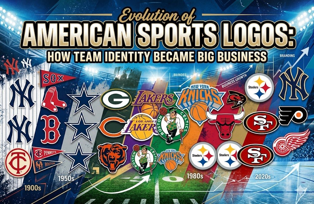
A sports logo carries more power than most people realize. Fans see it on jerseys, hats, stadium walls, old ticket stubs, trading cards, and championship Continue the Story




Sports History Group Facebook Posts

A century of Original Six history arrives as the Chicago Blackhawks, New York Rangers, and Detroit Red Wings celebrate their monumental 100-year milestone! 🏒百年 Founded in the legendary 1926 NHL expansion, these three franchises survived economic depressions, wartime roster shifts, and league revolutions while building the absolute foundation of hockey culture. From the historic Forum and Madison Square Garden battles to iconic sweater designs and legendary rivalry dynasties, the Class of 1926 defined professional hockey in North America. Read our full centennial history and branding retrospective on the blog! 👇#NHL #OriginalSix #Blackhawks #SportsBusiness #sportsbranding
KUCHEROV PASSES UP AN EMPTY NET GOAL?! 🏒🤯 | Ultimate UnselfishnessHe had the wide-open cage staring right at him… and STILL dished the puck! 😂💥 Tampa Bay Lightning superstar Nikita Kucherov left everyone in the arena stunned when he turned down a guaranteed empty-net tap-in against the Islanders just to feed his teammate instead! That’s what happens when your playmaker brain is permanently wired for assists—even with a tight 4-3 lead and zero goalie in the net, Kuch would rather share the wealth than pad his own goal total! 🏒⚡️ Peak hockey IQ or pure madness? Either way, you won’t see many superstars in the league turn down free points like that! 🍿✨Be honest—would you have buried the shot yourself or made the extra pass like Kucherov?! Let us know in the comments below! 👇 Drop a 🏒 if Kuch is the ultimate teammate!#NHL #NikitaKucherov #hockeyhighlights #sportsedits #nhlshorts
The Vegas Golden Knights’ primary crest is a masterclass in hidden geometry and expansion branding! ⚔️🖤 Designed by Brian Gundell and Adidas, the Spartan-style helmet hides a clean "V" for Vegas right in the negative space of the face opening, framed by a bold shield and gold trim. Paired with steel grey, gold, red, and black—plus the secondary "Vegas Star" swords logo—it bypassed predictable casino tropes to build an authentic championship identity from day one. Read our full design teardown and branding history on the blog! 👇#VegasGoldenKnights #NHL #sportsbranding #logodesigns #Hockey