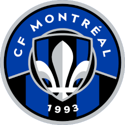
Once again, the Montreal FC team has changed its logo. This logo change represents an effort by the club to go back to its roots. This new logo and branding will serve as the club’s brand-new identifier for the 2023 season.
This decision is coming off the heels of a solid season that ended with an Eastern Conference Semifinal loss to New York City FC.
 The logo stands as a bold declaration of the club’s future prospects. However, it uses elements from the club’s past to portray that message.
The club’s finalized logo is a circular logo. According to the club, the circle symbolizes the team’s unity. The exterior of the circular logo has a bold silver outline.
The primary color scheme of the circular logo is blue. It’s been the predominant color of the franchise during its entire existence. Different elements of the logo separate the upper half of the circle and the lower half of the circle. The upper half of the circle contains a bold, curved “CF Montreal” wordmark in white with a solid blue background.
The lower half of the circle contains a “1993” wordmark in white. “1993” marks the year in which the franchise was founded as the Montreal Impact. The background contains blue and black stripes. The blue and black stripes are a callback to the early days of this franchise.
The center of the logo contains a shield. The shield is symbolic of the team’s strength and doggedness. The shield comprises a silver outline on its exterior. The inner part of the shield includes a Fleur-de-lis with blue and black stripes in the background. The Fleur-de-lis is representative of the Quebec province.
This logo is a complete about-face from its previous branding effort.
 In January last year, the franchise changed its name to Club De Foot Montreal. They replaced the shield logo with a snowflake full of M’s with directional arrows that were used to represent the metro system in Montreal. The logo also contained a blue border that represented Montreal’s rivers.
However, the logo was met with a heavy amount of criticism. This forced the franchise to go in another direction.
Certain aspects of this logo were seen in the club’s previous primary logo years ago. Years ago, the club had a silver shield logo. A smaller version of this silver shield can be seen in the middle of the team’s new logo.
Similar to its current logo, the previous logo has blue and black stripes on the bottom half of the logo.
Additionally, the previous logo has a Fleur-de-lis contained within the shield logo. This is similarly to the Fleur-de-lis contained within the small shield in the center of its new logo.
Sports History Group LLC manages the popular and successful websites Sports Logo History, Sports Team History, Sports Market History, and Sports New History. Each site brings incredible value for any hardcore fanatic or fan of their favorite team or teams within their favorite sport.
One of our sites is Sports Logo History, which is a community of sports logo enthusiasts who enjoys the history of each team’s logo. Also Sports Team History takes a look at the history of each and every professional sports team. In addition, we have added Sports News History to our sports history websites. 24/7 non-stop sports news that’s worth knowing. Finally, the premier sports team marketplace for your favorite team’s apparel, gear and gifts for professional and college with hundreds of items for you to peruse at Sports Market History.


Pingback: gimoti
Pingback: tadalafil 20 mg tablet