
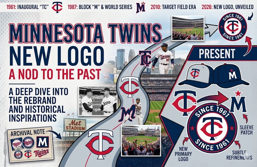
Few franchises have as much history as the Minnesota Twins. Founded in 1901, they were known as the Washington Nationals and the Washington Senators for the first 60 seasons of their existence. They officially became the Minnesota Twins in 1961. The franchise has 3 World Series titles and 6 pennants to its credit.
What Does the “TC” in the Twins Logo Stand For?
The “TC” stands for Twin Cities, meaning Minneapolis and St. Paul. When owner Calvin Griffith moved the Senators to Minnesota in 1961, the team avoided putting a plain “M” on its caps, because an M could be read as Minneapolis alone and the club did not want to upset St. Paul. An interlocking T and C solved the problem by standing for both cities.
Many fans think the red “C” looks like the Cincinnati Reds’ “C,” and the resemblance is real. In the Twins logo, though, the C simply stands for “Cities.”
The 2023 Twins Logo: A Nod to the Past
The Minnesota Twins unveiled a new look on November 18, 2022, the franchise’s first full brand overhaul since 1987. Teams usually change their logos to signal a new direction or reinvigorate a franchise. The Twins had missed the playoffs the previous two years, so reinvigoration was the order of the day.
 There is no question the updated TC logo is a nod to the past. Long-time Twins fans will immediately recognize it: a “T” encircled by a bright red “C,” creating the interlocked “TC” that represents the Twin Cities. For 2023, the serifs were removed from the T, the C was better centered, and both letters were set in a custom font designed by Matthew Wolff, the same font used for the block “MINNESOTA” and the players’ names.
The format is a throwback to the cap logo the franchise used from 1961 to 1986. There are some differences. The old “T” was dark blue and its ends dropped down a little, while the ends of the newest “T” are straighter. The “C” in the throwback logo was also a darker shade of red.
The refresh went well beyond the TC. A cursive “Twins” script, based on the team’s early Metropolitan Stadium-era wordmark, became the primary logo. The “M” cap returned with a red North Star above a block white M, and the colors stayed red, white and blue, with a brighter red and a darker navy.
 The changes extended to the uniforms as well. The Twins introduced four new sets for 2023, including gray pinstripes on the road and a cream home alternate with a “Twin Cities” script across the chest, a first for the franchise.
Minnesota Twins Logo History: A Timeline
- 1961: The Washington Senators move to Minnesota and become the Twins, wearing the interlocking TC on their caps.
- 1987: The Twins switch to a block “M” cap, keeping the TC as a sleeve patch. They win their first World Series in Minnesota that fall.
- 1999: After Calvin Griffith’s death, the TC returns as a home alternate cap in his honor.
- 2010: The TC becomes the team’s main cap logo again.
- 2023: A full brand refresh updates the TC, makes the cursive “Twins” script the primary logo, and brings back the “M” cap with a North Star.
You can see every version of the logo on Sports Logo History’s Minnesota Twins logo page.
Frequently Asked Questions
What is the C in the Minnesota Twins logo?
The C stands for “Cities.” Together, the interlocking T and C stand for Twin Cities, the Minneapolis–St. Paul area the team represents.
Why does the Twins logo look like the Reds logo?
The bright red C in the Twins logo has a similar shape to the C on the Cincinnati Reds’ caps, which is why so many fans ask. The two logos are not related: the Reds’ C stands for Cincinnati, and the Twins’ C stands for Cities.
When did the Twins change their logo?
The Twins unveiled their current logos and uniforms on November 18, 2022, for the 2023 season. It was the franchise’s first full rebrand since 1987.
How many World Series have the Twins won?
Three. The franchise won in 1924 as the Washington Senators, then in 1987 and 1991 as the Minnesota Twins.