
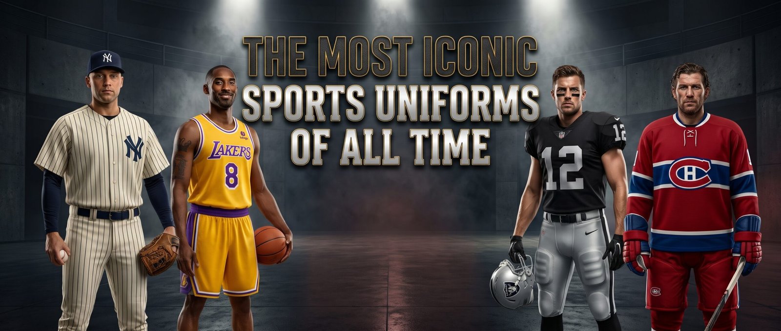
Sports uniforms are supposed to help fans tell the teams apart.
That’s the practical explanation, anyway. One side wears one color, the opponent wears another, and everyone gets through the afternoon without confusing the shortstop with the visiting third baseman. Humans then did what humans always do and turned basic clothing into mythology, identity, inherited loyalty, and an excuse to spend $180 on a shirt with somebody else’s surname stitched across the back.
The most iconic sports uniforms don’t merely identify a franchise. They summon entire eras. Yankees pinstripes bring Babe Ruth, Joe DiMaggio, Mickey Mantle, Derek Jeter, and October pressure into the room at once. Lakers gold recalls Showtime, Kobe Bryant, Shaquille O’Neal, and championship banners. Raiders silver and black carry an outlaw identity before the player wearing them has made a tackle.
A great uniform can make an average team look important. A bad redesign can make a historic franchise look like it lost a bet with a focus group. The best uniforms avoid that fate because they’re clear, distinctive, rooted in place, and connected to moments fans refuse to forget.
Why Sports Uniforms Matter
Sports uniforms matter because fans rarely experience teams as abstract organizations. They experience colors, symbols, numbers, fabrics, photographs, and the sight of a familiar jersey appearing beneath stadium lights. The uniform becomes the visible thread connecting players who may have competed 50 years apart.
That continuity creates emotional weight. A modern player wearing the same basic design as an old legend appears to inherit something, even when the two athletes never met. The team’s history walks onto the field with the current roster, which is considerably more dramatic than admitting everybody is wearing coordinated laundry.
The greatest sports uniforms also work without names or explanations. Fans can recognize the team from the color arrangement, helmet, stripe pattern, or lettering alone. When a uniform reaches that level, changing it becomes less like updating apparel and more like tampering with family photographs.
New York Yankees Pinstripes
The Yankees’ white pinstriped uniform may be the most famous look in American sports.
Pinstripes first appeared on the franchise’s uniforms in 1912, when the club was still known as the Highlanders. The Yankees later established the familiar home combination of white pinstripes, the interlocking NY over the chest, and no player names across the back. Apart from minor alterations, that basic home appearance has remained stable for decades.
The design’s power comes from restraint. There’s no oversized wordmark across the chest, no unnecessary color panel, and no effort to make the uniform look aggressive. The history supplies all the intimidation anyone could reasonably need.
Babe Ruth, Lou Gehrig, Joe DiMaggio, Mickey Mantle, Reggie Jackson, Mariano Rivera, and Derek Jeter all wore versions of the same visual language. As those names accumulated, pinstripes stopped being a pattern and became a form of baseball authority.
Plenty of teams have worn pinstripes. The Yankees made everyone else look like they were borrowing them.
Los Angeles Lakers Purple and Gold
The Lakers’ purple and gold uniforms look exactly like a glamorous basketball franchise in Los Angeles should look.
Owner Jack Kent Cooke introduced the purple-and-gold color scheme after the Lakers moved into the Forum in 1967, choosing colors intended to carry a regal feeling. The franchise traditionally wore gold at home, purple on the road, and later added Sunday white uniforms in honor of longtime broadcaster Chick Hearn.
The colors have carried several distinct eras without losing their identity. Wilt Chamberlain and Jerry West wore them. Kareem Abdul-Jabbar and Magic Johnson turned the gold uniform into the central costume of Showtime. Shaquille O’Neal and Kobe Bryant won three straight championships in updated versions, while Kobe later delivered his 81-point performance in the Sunday whites.
The Lakers’ uniform works because it has no interest in appearing humble. Purple and gold are royal colors, and the franchise behaves accordingly. Los Angeles doesn’t rebuild quietly, develop in obscurity, or settle gracefully into irrelevance. It expects stars, attention, and banners, and the uniform looks like it was designed with all three already scheduled.
Las Vegas Raiders Silver and Black
The Raiders’ silver and black uniform may be the strongest example of apparel creating an entire team personality.
Al Davis changed the franchise’s colors from black and gold to silver and black in 1963. The Raiders refined the pirate-and-shield helmet logo the following year, and the central look has remained remarkably consistent ever since.
The black home jersey, silver helmet, silver pants, and white road uniform don’t feel trendy because they were never designed around a particular trend. They’re blunt, severe, and easy to recognize. The combination also supports the franchise’s whole outlaw mythology, from the Autumn Wind and Raider Nation to the spiked shoulder pads and painted faces in the crowd.
Other teams have used black to look tougher. The Raiders built an identity so complete that almost every later black alternate uniform feels like somebody wandering onto their property.
The franchise has moved from Oakland to Los Angeles, back to Oakland, and eventually to Las Vegas. The uniform kept the Raiders looking like the Raiders when geography couldn’t make up its mind.
Green Bay Packers Green and Gold
The Packers’ green and gold uniform represents a different kind of football tradition.
Green Bay first wore green jerseys during the 1930s, but the franchise permanently established its green-and-gold identity in 1959, Vince Lombardi’s first season as head coach. Earlier Packers teams had experimented with navy, tan, gold, green, and several combinations before Lombardi’s version became the enduring standard.
The forest-green jersey, yellow-gold pants, striped sleeves, and plain yellow helmet with the oval G create one of football’s clearest looks. It feels old without looking obsolete, which is a difficult balance in a sport that keeps discovering new ways to place gradients where nobody asked for them.
The uniform also matches Green Bay’s unusual identity. This isn’t a giant-market team built around celebrity spectacle. It’s a community-owned franchise from the NFL’s smallest market, playing in winter weather at one of football’s most historic stadiums.
The Packers don’t need black alternates, chrome helmets, or a weekly fashion reveal. Green, gold, and frozen breath have handled the branding rather effectively.
Chicago Bulls Red, White, and Black
The Chicago Bulls’ classic uniform became a global basketball symbol during Michael Jordan’s championship era.
The basic combination was simple: bright red road jerseys, white home jerseys, black lettering and trim, and one of sports’ strongest logos on the shorts. The Bulls later introduced the famous black pinstriped alternate during the second three-peat, giving the dynasty another look without abandoning its central identity. NBA retrospectives continue to connect those designs with Jordan’s arrival and Chicago’s two separate runs of three consecutive championships.
The red jersey may be the most powerful version because it appears in so many enduring Jordan images. The final shot against Utah, the held follow-through, the number 23 moving through a hostile arena, and the Bulls script across the chest all became part of basketball’s visual memory.
Chicago’s uniforms didn’t need elaborate symbolism. Red looked fast and dangerous. Black made the contrast sharper. White kept the home version clean.
Jordan made the uniform famous, but the design gave his greatness the perfect frame.
Boston Celtics Green and White
The Celtics have built one of basketball’s strongest identities from two colors and a refusal to complicate things unnecessarily.
Boston’s traditional uniform system centers on the white home jersey and green road jersey, with block lettering, modest striping, and the team name placed across the chest. Even as the NBA expanded its alternate-uniform programs, the Celtics described uniform decisions as a balance between innovation and the franchise’s history, tradition, and pride.
That restraint fits the organization. The Celtics’ visual identity comes from parquet floors, championship banners, green warmups, and a lineage stretching from Bill Russell and Bob Cousy through Larry Bird, Paul Pierce, and later eras.
The uniforms don’t chase spectacle because Boston’s history already fills the room. A Celtics jersey is supposed to look like something Russell could’ve worn, Bird could’ve sweated through, and a current player can inherit without needing a complete visual explanation.
Some teams redesign themselves to remain relevant. The Celtics keep wearing green and wait for relevance to remember where it lives.
Dallas Cowboys White, Silver, and Blue

The Dallas Cowboys’ uniform is recognizable even though its colors contain enough subtle inconsistencies to make a graphic designer quietly stare into the distance.
The franchise began in 1960 with white helmets and blue stars before adopting the silver helmet that became its permanent visual centerpiece in 1964. The modern Cowboys built their identity around the navy star, silver helmet, white home jersey, and silver-toned pants, while the dark navy jersey became a less frequently worn road alternative.
The white jersey became especially important because Dallas often chose to wear it at home, reversing the usual football convention. That helped make the look inseparable from Thanksgiving games, nationally televised matchups, Roger Staubach, the 1990s dynasty, and the whole “America’s Team” machine.
The uniform works because the star handles most of the visual burden. Dallas doesn’t need an animal, wordmark, or elaborate helmet stripe to announce itself. One navy star against silver does the job from the farthest seat in the building.
The Cowboys have spent decades trying to return to their championship past. At least they’ve remained impeccably dressed while everyone waits.
Los Angeles Dodgers Home Whites
The Dodgers’ white uniform with royal-blue script is one of baseball’s cleanest designs.
The familiar look combines the flowing Dodgers wordmark across the chest, the interlocking LA on the cap, blue numbers, and a small red number on the front. MLB’s franchise history notes that the red front number was introduced during the 1950s, while the blue script and cap mark became recognizable far beyond Los Angeles.
The uniform connects Brooklyn and Los Angeles without feeling trapped in either place. Jackie Robinson wore Dodgers script in Brooklyn. Sandy Koufax, Fernando Valenzuela, Clayton Kershaw, and later generations carried the same basic visual identity in Los Angeles.
Its greatness comes from the details. The script feels relaxed without becoming soft. The blue is distinctive enough to earn its own familiar name. The tiny red number adds contrast without hijacking the design, a rare case of somebody adding another color and knowing when to stop.
The Dodgers have experimented with special editions and all-blue designs, but the classic whites remain the standard. Sometimes the original answer was already sitting there, minding its business.
Montreal Canadiens Red Sweater
The Montreal Canadiens’ red sweater looks less like a uniform and more like a piece of hockey inheritance.
Red, white, and blue have served as Canadiens trademark colors for more than a century, surrounding the CH crest that became one of the sport’s most recognizable symbols. The franchise itself dates to 1909, giving the jersey a direct connection to generations of Montreal hockey history.
The broad blue stripe through the center separates the Canadiens sweater from simpler red designs, while the white details keep the crest visible and balanced. It looks strong on the ice, in old photographs, and beneath Stanley Cup celebrations, which is about as complete a uniform test as hockey can provide.
The jersey’s emotional power also comes from place. In Montreal, the Canadiens represent language, culture, family memory, and an expectation of greatness built during eras when championships arrived often enough to feel inherited.
Calling it a jersey almost understates the relationship. Canadiens fans traditionally call it a sweater, and the older word fits. It sounds personal, local, and passed down, exactly like the garment itself.
Notre Dame’s Gold Helmet and Navy Jersey
Notre Dame’s football uniform proves that the helmet can carry nearly the whole identity.
The Irish traditionally pair plain gold helmets with navy or white jerseys and gold pants. The helmets have often carried no logo or team name, relying instead on the gold finish and its connection to the Golden Dome on campus. For decades, student managers mixed helmet paint that included actual gold dust associated with the university’s visual tradition.
That simplicity gives Notre Dame a ceremonial appearance. The uniform doesn’t look like a modern brand package assembled around alternate-release calendars. It looks institutional, old, and convinced that everybody already knows what they’re seeing.
The helmet catches stadium light differently from almost every other college design. Paired with the dark navy jersey and white numbers, it creates one of football’s most recognizable silhouettes without using stripes, decals, or unnecessary noise.
Notre Dame has experimented with special Shamrock Series uniforms, sometimes with mixed results because humans cannot leave a perfectly good thing alone. The classic version remains powerful precisely because it doesn’t require novelty.
Brazil’s Yellow Jersey
Brazil’s yellow national-team jersey may be the most recognizable soccer uniform in the world.
Brazil originally wore white as its primary color, but the defeat to Uruguay in the 1950 World Cup final triggered a national design competition. Aldyr Garcia Schlee created the winning replacement, combining a golden-yellow shirt with green trim, cobalt-blue shorts, and white socks so the uniform incorporated the colors of Brazil’s flag.
The design became connected to Pelé, Garrincha, Jairzinho, Ronaldo, Ronaldinho, Romário, Marta, and generations of attacking talent. Brazil’s World Cup triumphs helped transform the yellow shirt from a national kit into a global symbol of soccer imagination.
The uniform’s emotional meaning extends beyond championships. Yellow became associated with movement, flair, rhythm, technical skill, and the expectation that Brazil should play the game beautifully rather than merely win it.
That expectation can become a burden, naturally. Humans eventually turn every gift into an obligation. Still, few sports uniforms carry as much international recognition. A plain yellow shirt with green trim can make a neutral crowd think of Brazil before any crest appears.
That’s extraordinary visual ownership.
What Makes a Sports Uniform Iconic?
The greatest sports uniforms share several qualities, even when the designs look completely different.
They’re easy to recognize. The Yankees’ pinstripes, Raiders’ black jersey, Packers’ green and gold, and Brazil’s yellow shirt remain clear even from far away. Strong uniforms don’t rely on tiny details that disappear once the game starts.
They also fit the team’s personality and location. Lakers gold belongs in Los Angeles. Notre Dame’s gold helmet belongs beneath the Golden Dome. Raiders silver and black matches the franchise’s outlaw mythology. Brazil’s colors represent the national flag while carrying decades of soccer meaning.
Most importantly, the uniforms stay connected to history. Great design helps, but repeated moments make the design sacred. A jersey becomes iconic after champions, heartbreaks, rivalries, and family memories gather inside it.
Fabric alone can’t do that.
Time does most of the work.
Why Constant Redesigns Usually Fail
Teams redesign uniforms because new merchandise sells, attention matters, and somebody in a presentation has used the phrase “modern visual ecosystem” without being asked to leave.
Sometimes change works. Outdated typography can be cleaned up. Poor color balance can be fixed. A design carrying offensive imagery may need to be replaced rather than defended through nostalgia. Evolution isn’t automatically disrespectful.
But constant redesigns prevent uniforms from collecting memory.
A team needs visual continuity long enough for children to associate the jersey with stars, parents to associate it with old games, and older fans to see the same basic colors across several generations. If the uniform changes every few years, the franchise starts looking like a series of disconnected marketing campaigns.
The greatest sports uniforms aren’t frozen because designers ran out of ideas.
They’re protected because the idea already worked.
The Legacy of Sports Uniforms
The legacy of sports uniforms is that they turn teams into images fans can carry anywhere.
Yankees pinstripes became baseball authority. Lakers purple and gold made basketball look regal and theatrical. Raiders silver and black turned menace into a complete franchise identity. Packers green and gold made small-market football feel permanent. Bulls red, white, and black gave Michael Jordan’s dynasty a global visual language. Celtics green and white connected championships across generations. Cowboys silver, blue, and white made one star recognizable across the country. Dodgers script gave baseball one of its cleanest classic looks. The Canadiens sweater carried more than a century of hockey history. Notre Dame’s plain gold helmet made simplicity ceremonial. Brazil’s yellow jersey became a worldwide symbol of soccer itself.
These uniforms matter because players leave.
Coaches get fired.
Stadiums close.
Leagues change rules.
Sponsors arrive in places fans would prefer they didn’t.
The uniform remains, carrying every memory that happened inside it.
A great sports uniform doesn’t merely make a team look good.
It makes history recognizable before anyone says a name.